Wednesday, 18 December 2013

Promo poster

Worked on my promo poster today.  Not as easy as i anticipated! Kinda wish my standards weren't so high! But i guess thats a good thing......
Started by searching out 'book promo posters' on Google, but couldn't find anything inspiring at all, oh but for one, but guess who?! None other than Mr Shepard Fairey!
http://theworldsbestever.com/blog/wp-content/uploads/2009/05/shepard-fairey-johnny-cash-poster.jpg

Now this is great, but i knew that i wasn't going to be able to produce something like this just yet, but i knew from looking at this that i should stick to the existing colour palette, but go light on the background, as the book itself is very dark.

So after much trial and error, with extruding/bevelling/opacities etc, the poster is now done.

Wednesday, 11 December 2013

Book Cover Finished

Can't quite believe how well i got on today, managed to finish my Penguin book cover.  I had a rough idea sketched up, and copied that as best i could.  Once i'd got the basics knocked up, i started adding some effects in, drop shadows, inner glow etc.  The reason being that the design is very text heavy, so i needed said text to loo as good as possible.  My colour choices worked brilliantly together.

I knew in that i wanted a subtle London skyline in the background, as well as a Lancaster bomber, as per the first line in the book about Godfrey getting shot down over Berlin during WWII.  I know that a Spitfire couldn't make it that far, so a Lancaster it had to be, as i also wanted it to be iconic.
I managed to find some London skyline vectors online, but they weren't quite what i wanted.  They had things like the London Eye, and The Gherkin, which wouldn't have existed when the book was set, so i found some classic London landmarks and put them together, and it worked a treat!

The fonts i chose also looked really good.  Eventually i decided to ditch the Lancaster, as it looked like it was flying over London, and that isn't really appropriate, and it just was a bit too much imagery for the amount of space i was playing with.

So that was the last executive decision i made on the cover, so it was finished! And i'm very pleased with it, just got to do the promo poster and branding guidelines.

Thursday, 5 December 2013

Start of my book cover

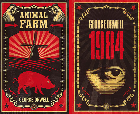
Got cracking on my book cover today, Andrew showed me how to create a colour pallet from a few of the Shepard Fairey work i posted on my previous blog.  I imported the book cover of 'Animal Farm' as a reference.

I had the idea that i wanted a more text heavy cover, as i couldn't find a good enough theme that run through the book that i could visualise.  The title is quite long, and there is a lot of blurb that needs to go on the front cover, so i also did not want to overload it with large images as well.

I sketched up a design, that had the title as large as i could get away with, but in perspective, so the 'what' and 'carve' are really big.  I knew i also wanted something to do with London in the background, like a skyline or something.  Also the first line of the book is about Godfrey Winshaw getting shot down over Berlin during WWII, so i wanted some sort of RAF plane in there somewhere.

I thought that should probably cover it.  I decided that i wanted the fonts typeface six, typeface seven, and industria, all fonts by Neville Brody. 

Monday, 2 December 2013

Shepard Fairey

I've found the work of Shepard Fairey very inspiring over the last few weeks.  I touched on his work briefly in a previous post, as i found some book covers done by him, but thought i'd write about him in a bit more detail as i'm thinking of basing the style of my book cover on his work.

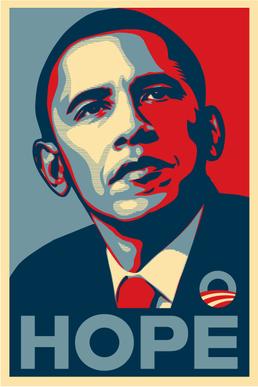
Shepard rose to popularity during '08, when his Barack Obama poster 'Hope' was released, along with a matching sticker.
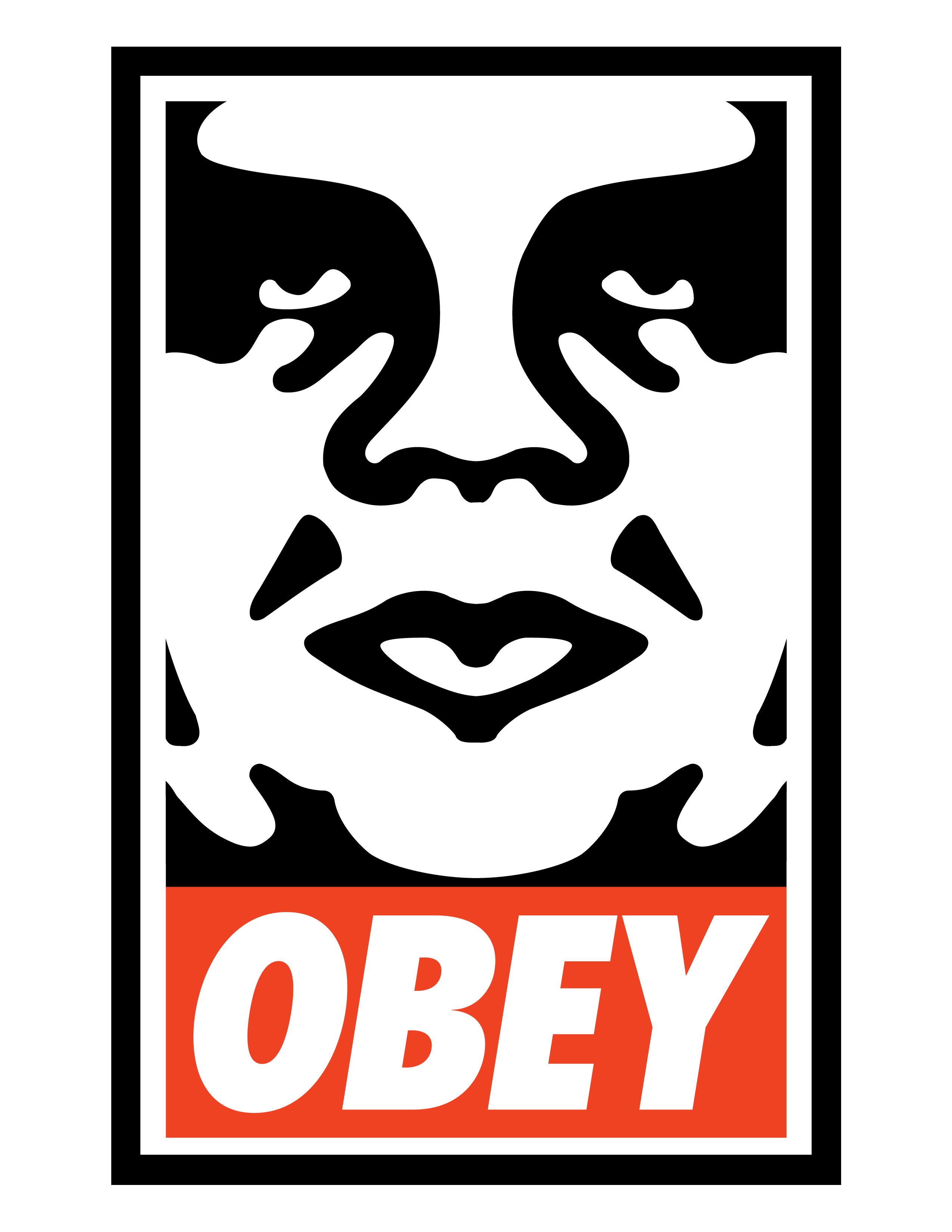
These were not commissioned by Obama's campaign team, although they were interested in it, and Fairey eventually got a thank you letter from Obama himself.  He was known well in the underground scene before this though for his 'Andre the giant has a posse' poster in 1989.  This design was then turned into a stencil and used on stickers, and were stuck all over the world.  The image itself has no particular meaning.
And this one, the current and most well known version....
Shepard formed Obey clothing in 2001, which is now a very well known brand, which it appears in recent years has been extensively faked unfortunately.

Shepards work is heavily inspired by wartime propaganda posters, especially it seems from Russia.
Here are some great and classic examples of Fairey's work.....
And the book covers i originally saw that led me to start being interested in him....
Very inspiring stuff, with a very definitive style running through of clean lines and bold colours which i really like.  Not sure i'm going to be able to produce something of his caliber, but i'll give it a good go!