Wednesday, 18 December 2013

Promo poster

Worked on my promo poster today.  Not as easy as i anticipated! Kinda wish my standards weren't so high! But i guess thats a good thing......
Started by searching out 'book promo posters' on Google, but couldn't find anything inspiring at all, oh but for one, but guess who?! None other than Mr Shepard Fairey!
http://theworldsbestever.com/blog/wp-content/uploads/2009/05/shepard-fairey-johnny-cash-poster.jpg

Now this is great, but i knew that i wasn't going to be able to produce something like this just yet, but i knew from looking at this that i should stick to the existing colour palette, but go light on the background, as the book itself is very dark.

So after much trial and error, with extruding/bevelling/opacities etc, the poster is now done.

Wednesday, 11 December 2013

Book Cover Finished

Can't quite believe how well i got on today, managed to finish my Penguin book cover.  I had a rough idea sketched up, and copied that as best i could.  Once i'd got the basics knocked up, i started adding some effects in, drop shadows, inner glow etc.  The reason being that the design is very text heavy, so i needed said text to loo as good as possible.  My colour choices worked brilliantly together.

I knew in that i wanted a subtle London skyline in the background, as well as a Lancaster bomber, as per the first line in the book about Godfrey getting shot down over Berlin during WWII.  I know that a Spitfire couldn't make it that far, so a Lancaster it had to be, as i also wanted it to be iconic.
I managed to find some London skyline vectors online, but they weren't quite what i wanted.  They had things like the London Eye, and The Gherkin, which wouldn't have existed when the book was set, so i found some classic London landmarks and put them together, and it worked a treat!

The fonts i chose also looked really good.  Eventually i decided to ditch the Lancaster, as it looked like it was flying over London, and that isn't really appropriate, and it just was a bit too much imagery for the amount of space i was playing with.

So that was the last executive decision i made on the cover, so it was finished! And i'm very pleased with it, just got to do the promo poster and branding guidelines.

Thursday, 5 December 2013

Start of my book cover

Got cracking on my book cover today, Andrew showed me how to create a colour pallet from a few of the Shepard Fairey work i posted on my previous blog.  I imported the book cover of 'Animal Farm' as a reference.

I had the idea that i wanted a more text heavy cover, as i couldn't find a good enough theme that run through the book that i could visualise.  The title is quite long, and there is a lot of blurb that needs to go on the front cover, so i also did not want to overload it with large images as well.

I sketched up a design, that had the title as large as i could get away with, but in perspective, so the 'what' and 'carve' are really big.  I knew i also wanted something to do with London in the background, like a skyline or something.  Also the first line of the book is about Godfrey Winshaw getting shot down over Berlin during WWII, so i wanted some sort of RAF plane in there somewhere.

I thought that should probably cover it.  I decided that i wanted the fonts typeface six, typeface seven, and industria, all fonts by Neville Brody. 

Monday, 2 December 2013

Shepard Fairey

I've found the work of Shepard Fairey very inspiring over the last few weeks.  I touched on his work briefly in a previous post, as i found some book covers done by him, but thought i'd write about him in a bit more detail as i'm thinking of basing the style of my book cover on his work.

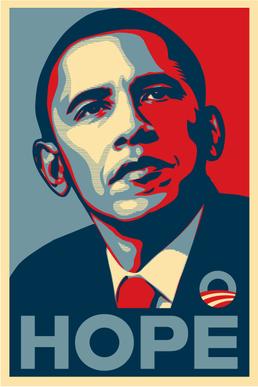
Shepard rose to popularity during '08, when his Barack Obama poster 'Hope' was released, along with a matching sticker.
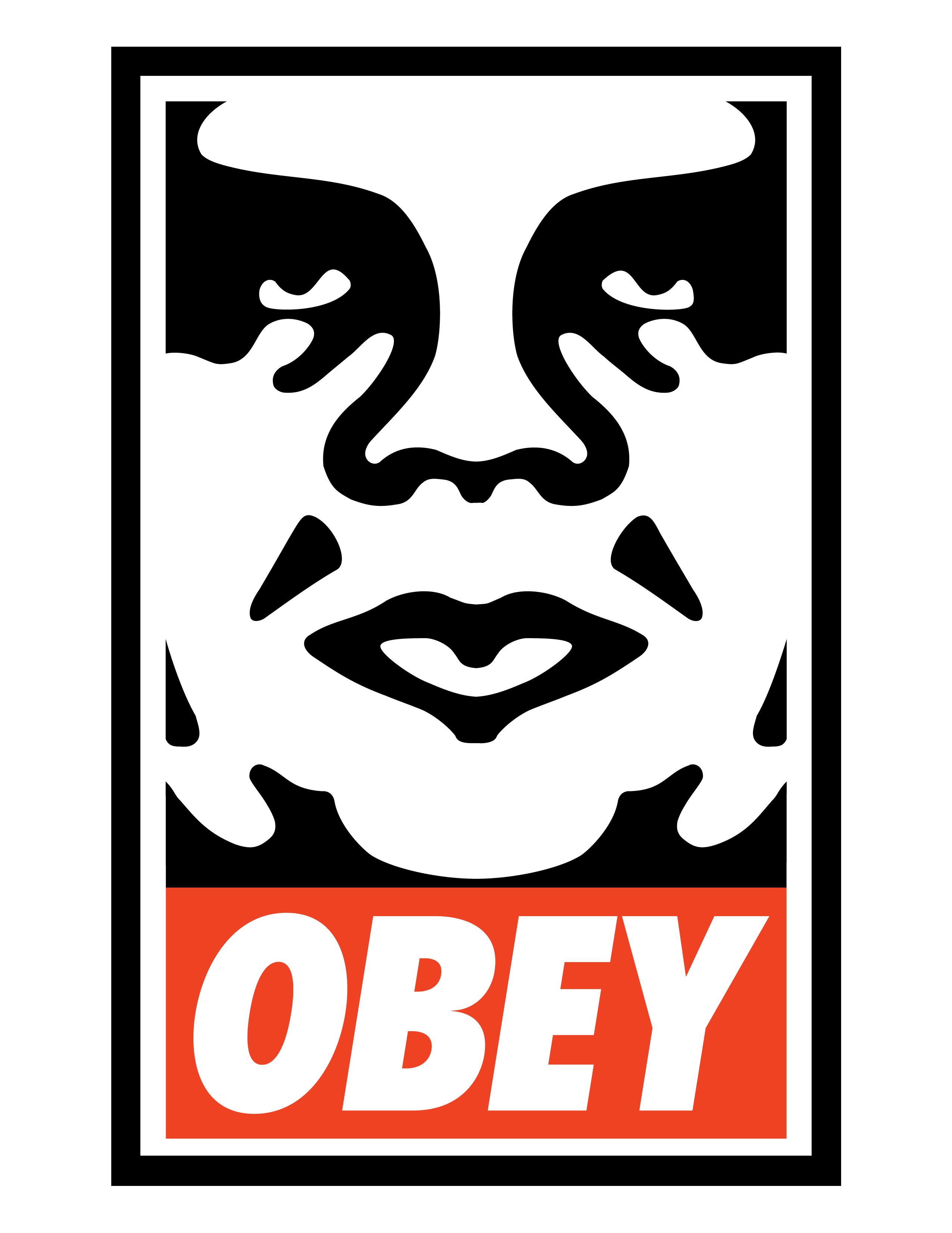
These were not commissioned by Obama's campaign team, although they were interested in it, and Fairey eventually got a thank you letter from Obama himself.  He was known well in the underground scene before this though for his 'Andre the giant has a posse' poster in 1989.  This design was then turned into a stencil and used on stickers, and were stuck all over the world.  The image itself has no particular meaning.
And this one, the current and most well known version....
Shepard formed Obey clothing in 2001, which is now a very well known brand, which it appears in recent years has been extensively faked unfortunately.

Shepards work is heavily inspired by wartime propaganda posters, especially it seems from Russia.
Here are some great and classic examples of Fairey's work.....
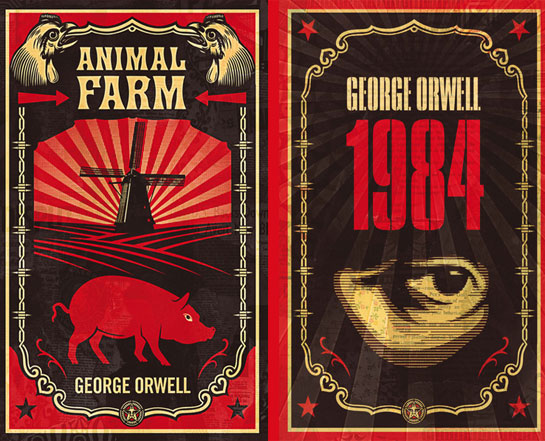
And the book covers i originally saw that led me to start being interested in him....
Very inspiring stuff, with a very definitive style running through of clean lines and bold colours which i really like.  Not sure i'm going to be able to produce something of his caliber, but i'll give it a good go!

Tuesday, 26 November 2013

Vorticism

Andrew introduced me today to Vorticism.  

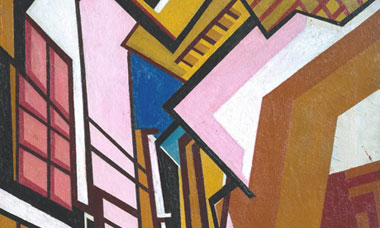
Vorticism was a short-lived modernist movement in British art and poetry of the early 20th century. It was partly inspired by Cubism. The movement was announced in 1914 in the first issue of BLAST, which contained its manifesto and the movement's rejection of landscape and nudes in favour of a geometric style tending towards abstraction. Ultimately, it was their witnessing of unfolding human disaster in World War I that "drained these artists of their Vorticist zeal". Vorticism was based in London but international in make-up and ambition. (Wikipedia)

This i found quite relevant, as the book i am reading, is mainly set in the late 80's, and even though Vorticism was started in the early 20th century, some of the paintings are quite 80's style (no doubt 80's designers were heavily influenced by Vorticism even!)

Some examples...
As there are quite a lot of chops and changes in the story, i'd maybe prefer to stick to one overall theme for the cover, e.g. a common 80's style theme.  This is certainly good insipration.


Tuesday, 19 November 2013

Alternative Covers

As obvious as it sounds, i also thought it might be a good idea to look at all the other 'What a Carve Up!' covers that have been used since its release in 1994....


Above is the one of the original covers, showing Shirley Eaton and Yuri Gagarin.  Shirley is a character from the film 'What A Carve Up' that young Roddy goes to see with parents as a child.  Strangely they both play very little in the story, and i struggle to see the relevance of them in the big picture.  The only conclusion i could come to, is that sex sells, and the astronaut, almost looks like he is checking her out.
This cover (above), appears to show a young Roddy Winshaw.  Again in the background is a much larger image of Shirley.  This i think works much better as a cover, but still curious as to why they would use a young Roddy, as its such a small part of the book.
This cover again depicts a scene from the film of the same name, but this time with nothing else relevant to the story in the image.  Again it may work as it has an attractive woman on the cover, but in my opinion is not a particularly good design.
Now this cover is completely different.  Just two simple colours with a small silhouette of a man.  The 'H' of the word 'What' has been stylised to resemble a house.  Also the typeface is quite comedic, which in itself gives you a good idea of the style of the book.

I like this cover.  Even though it has a huge grey blank space, it creates an atmosphere, and tells quite a few stories in one image.  Its obviously all hand drawn, and the effect is very nice.  The only criticism i have is the white drop shadow, which seems pointlessely out of the way, even going of the page.
This cover i don't like much, but it does work to set the scene of the 80's, that almost Sex Pistols style of cut and paste.

Interestigly it was also called 'The Winshaw Conspiracy', so this bought up some other covers.....
This cover paperers to relate the Winshaw house, as featured in the beginning of the book.  Interestingly, the roof has been left off, but then there isn't anything going on in the house which i find odd.  But its actually a very nice illustration, and i like the chequer around the edge.
This cover depicts again, the Winshaw house in the beginning of the story, with the burglar who was accidentally killed, the butler, and some of the other Winshaw family.  Again a very nice illustration, one of, if not the best cover of the lot.


Book cover research

Today i decided to start looking at existing book cover art.  I started by literally typing in 'Excellent book covers', may as well start with the best! I admit the results it threw back, weren't exactly as good as i thought they would be, but then everyones opinion is different.

The first result on the page was a surprisingly good start, and a classic- Antony Burgess's 'A Clockwork Orange'.  The designer David Pelham has gone for a very simple style of bold colours with black outline, almost cartoon-y.
But he encapsulates the main characters style very well, and almost hides the violent undercurrent of the story.
The next few i only really chose as i thought the cover design was clever.  'Girl Land' by Cailtin Flanagan-

I think this is an interesting cover, as the artist has put the title and author in amongst the image, so it looks like it was there when the picture was taken.  You can also get a good idea of what the book is about just from the picture, i automatically assume its a book about young girl growing up aspiring to be a woman, and from a quick read of a revue, that is pretty much the general gist.

This design, although completely different, has some similarities, namely the placing of the title and the author in with the main image.  I definitely prefer this cover being that its more colourful, and its a good quality illustration which looks like it has been finished off on a computer, maybe to do the colouring (the effect over the moon kind of gives it away.
That one and the next few, i'm literally only looking at them for their design quality.  The next two stuck out like a sore thumb to me, as they are by and illustrator that i admire- Shepard Fairey, who runs the clothing company OBEY, famous for their Andre The Giant face in many of their logo's and poster campaigns.  He was commissioned by Penguin to do both of these-


They both encapsulate Shepard's style perfectly, which i'm guessing is the reason they asked him!  These covers especially i find very inspiring.

The next cover is one from a previous Penguin competition, and entry for the book 'The Big Sleep'.

This was done by a guy known as 'C-Clancy' on DeviantArt.  Its an excellent piece of illustration, and more than likely was done on Photoshop/Illustrator.  Even though the main illustration would have been very complex to draw, he has still managed to keep the overall cover nice and simple by placing the book name over the top of the illustration which works very well.

Wednesday, 13 November 2013

1980's Typography

Like i said before, as i haven't got the book yet, and as i know it was set in the 80's i thought i would look up 80's typography to start with.
Neville Brody done some excellent typography in the 1980's magazine, 'The Face'....

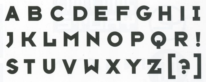
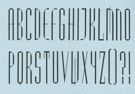
These are some quite stereotypical examples of 80's typefaces

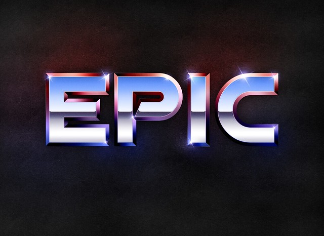
I love these chrome effects, very 80's

Started my new project today, a design for the book 'What a carve up', by Jonathan Coe, published by penguin books.

Better late then never, should have started a week ago, but somehow forgot to print the brief....
So for a start, i got the book ordered on amazon, found a second hand one for 99p, good start.  But as i haven't got the book to read, i thought the best place to start would be Wikipedia.  It gave me a good overview of the book and lets you know what characters are in it.  So i knocked up a rough family tree of the main featured family in the book, so i could keep tabs on who is who when i'm reading it.  Obviously i'm not going to get my hands on it for a few days.


Wednesday, 6 November 2013

Finally managed to finish my science poster.  I'm pretty pleased with the outcome, manage to suss out how to get some final little details in which were important......

Friday, 1 November 2013

Been flapping a a bit this week as its half term and help in Illustrator is not at my disposal as it was before! But alas i persevered and watched a ton of You Tube vids and sussed everything out i  needed to.
Had a lot of fun with the gradient tool, and making compound paths, which is very useful.

Pretty much got my poster finished now.  Its how i want it, just needs a few tweaks....

Monday, 21 October 2013

So i've pretty much decided that i'm going to go with this as my final design.

Obviously this is just a rough sketch, but i'm going to draw my superhero guy, similar to the one you see here, but with steampunk style clothing.  I'll do the font in Carnivale Freakshow font...
...and use this colour palette....
,,,,and that is as far as i am.....!

Wednesday, 16 October 2013

DONE MY FIRST PRESENTATION TODAY! 

May not seem like a big deal to some, but i haven't ever been shown how to do one, or had any help with this whatsoever, so i'm pretty damn pleased with myself!

Tuesday, 15 October 2013

Steampunk Art

Right, i've got to do my presentation tomorrow on my chosen style for my science poster.  I've decided to go Steampunk as to be honest i'm getting a little bit overwhelmed by the amount of work, and thinking i'm having to do! So i need to start concentrating on one thing.

So time to do a bit of research into Steampunk art. to get a feel for how artists interpret  the genre.
Again, the theme of sepia tones, industry etc.
There generally isn't any artists that specialise in steampunk art, but there is a lot artists that dabble with it, and come up with some exceptional work.
This (above), is a great image, fits the steampunk style down to a T.  All the colours and toning are very stereotypical, and the image of the gent, is exactly what you would think of when you think steampunk.  The picture is an interesting mix of sketched style and computerised colouring.
This i think is great, it isn't actually a real car, but someone has designed a steampunk wrap for an Audi R8, on the game Forza Motorsport 4.  Its very effective, even with the modern wheels, as they are grey, they blend in quite well, but i think a set of retro wire wheels in bronze would look amazing in real life.
Now this again is completely different.  Someone has used mechanical brass parts to make up a model of a grasshopper, in the classic steampunk style.
This a digital photo realistic image of what appears to be a steampunk style Tank Girl.  You can see the industrial look very clearly, with what appears to be some sort of coal burning device on her back, which i guess powers her mechanical arm.

B-movie posters

So, B-movie posters is another potential style for our science posters.  I have done some research into B-movie posters before, so this definitely got my attention.

The good thing with B-movie posters is they already have the layout sorted, so it gives me a good idea of where to place bits like title and tagline.  They also have excellent colours, so lots of inspiration.

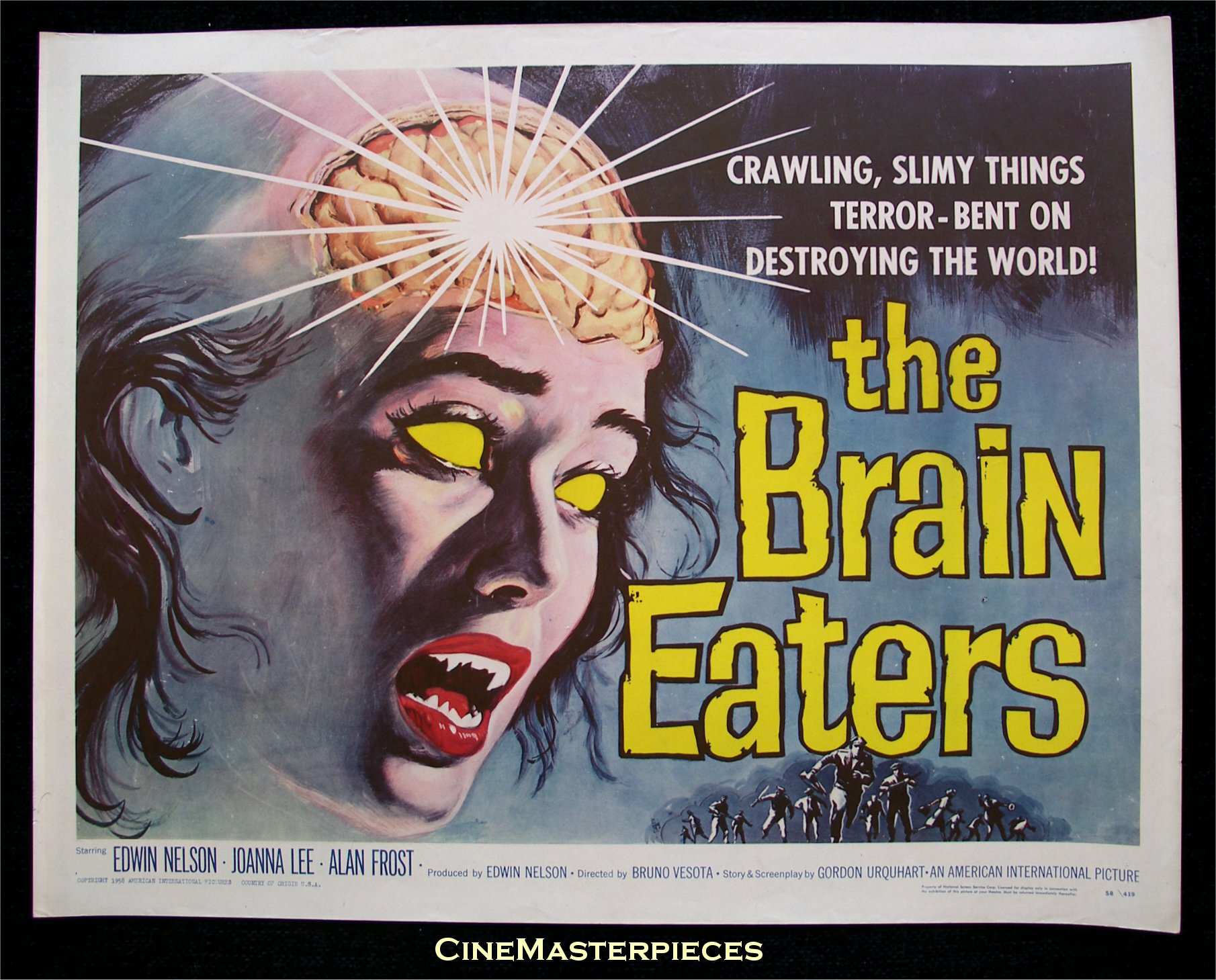
This was always a favourite of mine

Its quite an extreme image to put on a poster for the general public to see!

Also some of them are quite 'sciency' anyway....

But generally, i think i would only use the layout as a guide as most of the content of the posters isn't appropriate.  

Saturday, 5 October 2013

Victoriana Style

Victoriana is the next 'style' i needed to investigate.  Obviously i know that Victorian relates to the reign of Queen Victoria, but as ignorant as it sounds, i'd never heard of the phrase 'Victoriana', so straight to Wikipedia i go, and low and behold, it literally just means 'style from that era'. Good! Simple!

So i then see where the steampunk fans get one of their influences, clothing style is very similar, but the colouring goes a lot darker when applied to steampunk.

When i search DA (Deviant Art), the results are quite vague, as its doing a keyword search, and some people obviously just bung any old crap in their keywords box.

Google on the other hand throws up a lot more pics based on the style.  Seems the general consensus is pastel shades, corsets, frills etc.  For the clothing anyway.  Interior style wise is very plush, big drapes padded seating, huge extravagant picture frames.  Lots of gold and red.

Doing a search for Victorian posters was a good idea, loads of cool stuff http://soak-blog.andrewkelsalldes.netdna-cdn.com/wp-content/uploads/2011/09/victorian-graphic-designs.jpg.
This i thought would work well as a base for what i need to do.....

These remind me a lot of art nouveau, NOW THERES A GOOD IDEA! http://vepca.files.wordpress.com/2012/09/petrole-hahn.png All of a sudden this is becoming more interesting......

Thursday, 3 October 2013

Steampunk...

SO.  Got the task to create a promotional poster for the science department (A-level/6th form), to try and pull more females onto their relevant courses.  One of the potential styles i was given was steampunk.  I do roughly know what the steampunk style is, but thought i'd delve in a bit more.

A good place for me personally to start is my Deviant Art account (http://pauldavidlett.deviantart.com), as you get a a lot better array and quality of images than you do on google (http://www.deviantart.com/?q=steampunk).

It seems if you were to generalise it to average Joe, you could say 'think of the industrial age and the victorian age, throw them together and add a splash of cogs, goggles, top hats and sepia'.

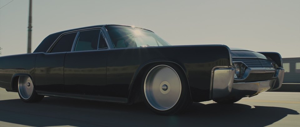
Not entirely sure i really like this style myself, but it certainly is an interesting concept, makes you wonder what other crazy mash ups you could do (the cars from the film 'In Time' spring to mind, http://www.imcdb.org/i457662.jpg.  A mash up of 60's american muscle and modern styling and tech)

Steampunk transformers also got my attention! http://25.media.tumblr.com/tumblr_m548d4xM2X1qbf5yuo1_1280.jpg.  But going off track a little there.......or maybe not?

Wednesday, 2 October 2013

Day two.....

Second day of my FdA in Digital Media Design.  Learned a lot already which i'm pretty pleased about.....watch this space!